Every end of August, many companies begin launch their new catalogs for 2021 (we saw the new Ikea catalog in the previous article).
JOTUN, a Norwegian paint company, also presented the new colors for 2021 on August 20th. 29 colors that compose 4 different palettes.
The palettes are presented through four stories that help us rediscover the home with new shades and combinations. REDISCOVER is in fact the name chosen to describe this new collection of colors: the rediscovery of the house, in these uncertain times, but also the rediscovery and reinterpretation of some of the company’s historical shades.
“In uncertain times, our homes become even more important,” says Lisbeth Larsen, Jotun’s global color manager. “We want to feel safe and protected, and with colours we can create the nourishing atmosphere we need. Our needs can vary from day to day, and from room to room. With beautiful colours and contemporary colour combinations, a complete home is created, with room for both aesthetics and everyday life.”. “
As always, the images created for the catalog are beautiful and very inspiring: this year too the styling was entrusted to the talented duo formed by Kråkvik and D’Orazio.
So let’s see the 4 new palettes.
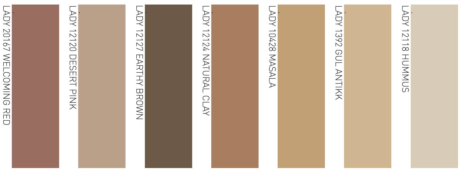
WARM AND RUSTIC COLORS
This palette continues the trend of warm earthy colors that we have seen in recent years. It is the warmest palette, a mix of colors that create a welcoming, rustic atmosphere with exotic flavors.
Jotun takes its inspiration from the colors of the earth, an element that unites all countries and cultures, and from the colors found in the world: from the golden pink shades of the Moroccan desert sand to the burnt orange of Mexico, passing through the color of the mix of Indian spices “Masala” or the “Humus” of Arab countries.
They are the perfect colors for those who love travels, exotic atmospheres and for those who like to discover new cultures and their craft traditions.


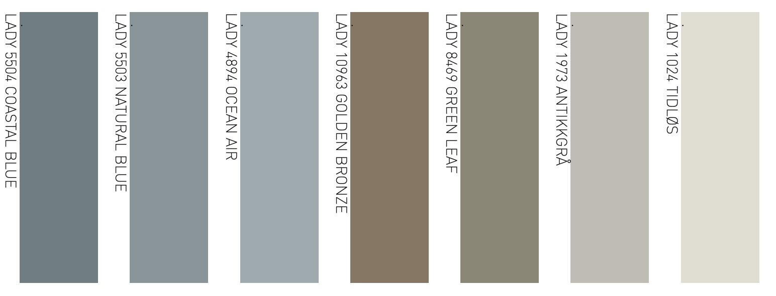
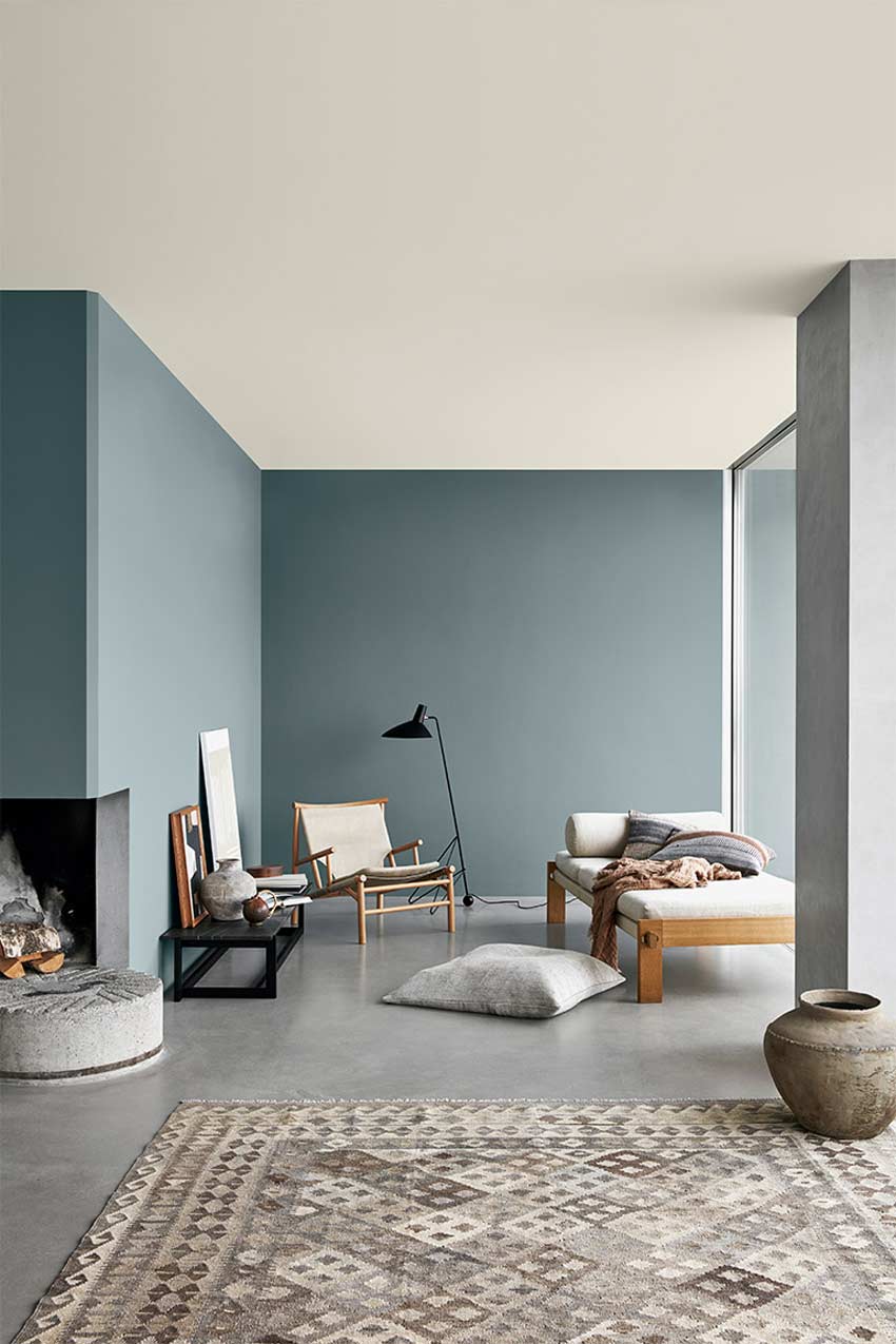
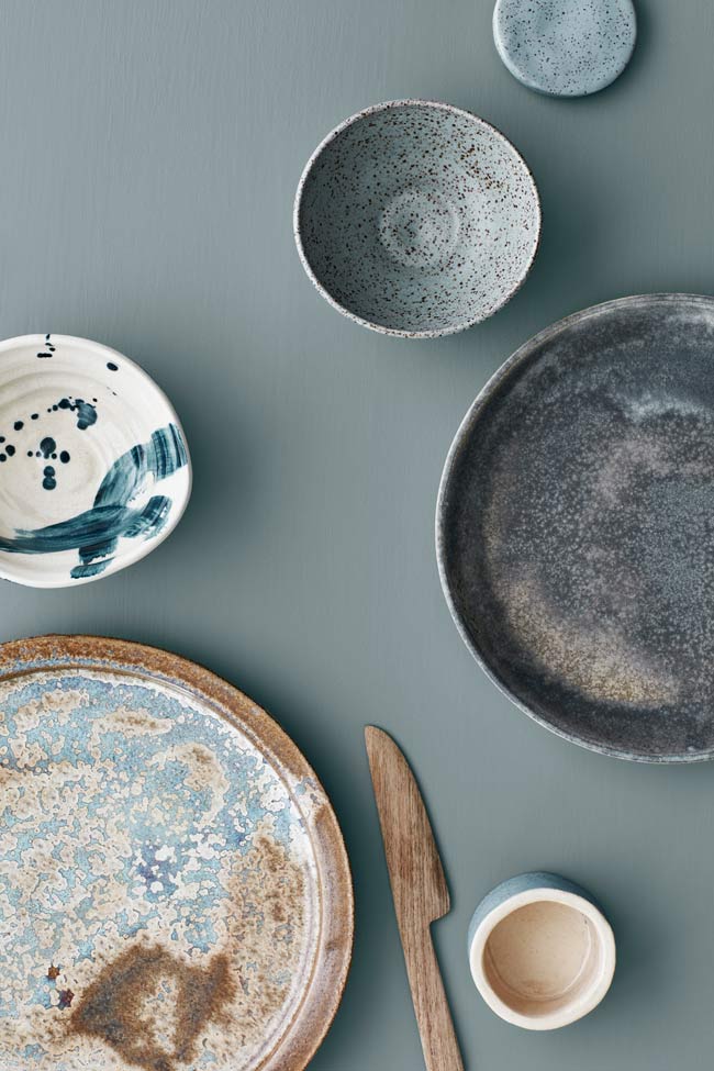
AIRY AND SOFT BLUE TONES
This palette is inspired by the colors of the sea to bring home the same tranquility that the view of a pristine coastal landscape, the sea, the sky and the horizon gives us. The “marine” shades are accompanied by a golden bronze and a very soft green leaf which also recall the nature of the Nordic countries.
These colors invite us to live in the present and to seize the moment. They create a welcoming and harmonious atmosphere at home, a place to find refuge and recharge your batteries.

DREAMY AND MUTED PASTELS
This is perhaps my favorite palette, certainly the most original of the 4. It is a very soft pastel color palette that creates an effect far from that childish and sugary world often associated with classic pastel tones. It is in fact a dream palette, with clear references to the 70s but always with an eye to the future.
These colors bring energy and optimism, stimulate imagination, imagination and creativity. The perfect palette, then, for those who work in the arts or for those who love to insert pieces of art and design objects at home.
Very nice is the combination of these pastel colors with warm browns.
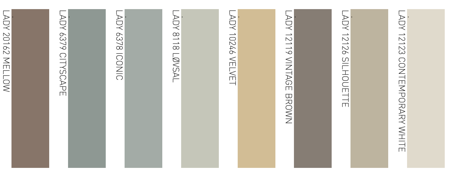


SOFT AND WARM NEUTRAL COLORS
And of course, a neutral color palette could not be missing.
In these times of uncertainty and great changes in our habits, we feel the need for a home where to find calm and serenity, where we can relax and forget problems for a moment. We therefore need to free ourselves from the superfluous and simplify the home and we can also do this by using neutral, discreet and harmonious colors.
In this case, the palette is a mix of warm neutral colors, ranging from off-white to sand, from beige to brown.
Exactly a year ago, I wrote you about beige as a neutral color in this article and how it was taking the place of white. I was right!


What is your favorite palette?
If you like my articles on color, you can find all them at the Colors Inspiration tag
Photografy: Line Klein. Stiling: Kråkvik e D’Orazio
Leggi il post in ITALIANO – Lee la entrada en ESPANOL
Leave a Reply